Why is it that some shapes that initially look odd get more acceptable with time?
Oh no! It’s happening again. I’m beginning to appreciate a design that I earlier just couldn’t wrap my head around. New shapes, forms and proportions that initially looked awkward are slowly starting to look better. Has this happened to you? I bet it has. Car designers who go bold with their designs clearly know something we don’t.
There’s something oddly human about the way we respond to car design. Much like meeting someone from the other side of the globe for the first time, experiencing a new cuisine, or seeing a new art form, our initial impressions are often shaped by instinct. This includes admiration, confusion, and occasionally – when the car or the art looks radical – outright rejection. But give it time, and often the new lines and fresh forms begin to draw admiration. Then the proportions settle into place, and what once felt alien starts to feel familiar. This may not happen at the same pace or same speed for everyone, but the new shapes and forms soon start looking more and more attractive. So when it comes to car design, the provocation often seems deliberate. Odd proportions, features that look very different, and the sum of parts are so far from the norm that your initial reaction isn’t positive. At all.
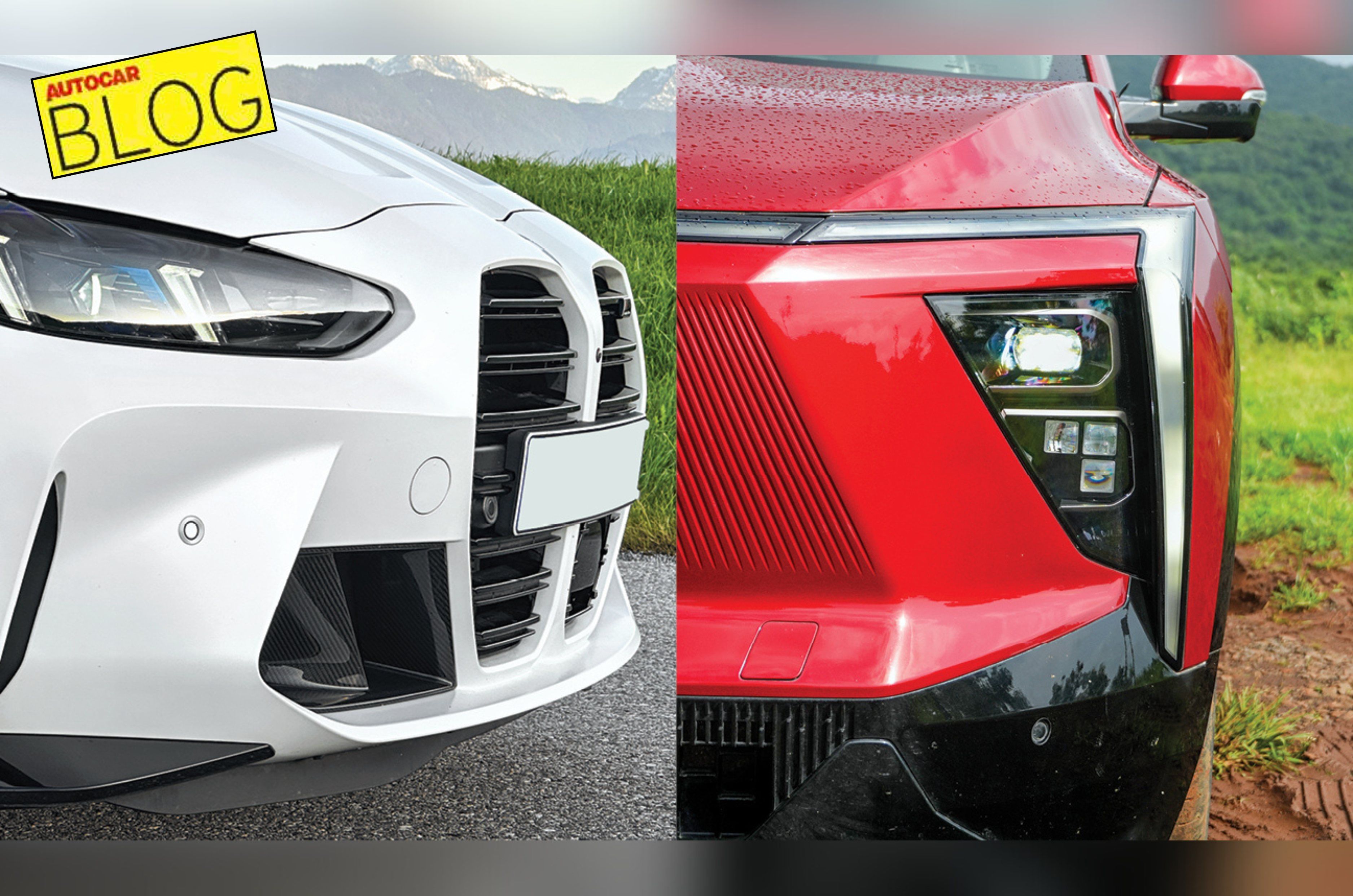
This has happened time and again. The first time I laid eyes on the new BMW M3, I couldn’t quite make sense of it. The oversized kidney grille, the flattened rear – it looked downright odd. Still, over time, you get more familiar and begin to see what the designer intended. This isn’t just about aesthetics. It’s about familiarity. Psychologists call it the “mere exposure effect” – the more we see something, the more we tend to like it. And in the world of car design, this plays out in fascinating ways.
Take the case of the Mahindra XEV 9e. When it first launched, its sharp details and chunky stance felt unconventional. Fast forward to today, and it’s one of the most recognisable shapes on Indian roads, with an identity of its own. And that’s priceless.
Designers know this and often have to walk a tightrope between innovation and recognition. Too much change, and the audience recoils. Too little, and they are indifferent. That’s why some of the most radical designs evolve and get better with every generation. Look at the Porsche Cayenne SUV. Years of constant refinement, each generation nudging the envelope just enough to stay fresh, but never so far as to look bland. And that’s what it is, finding a balance that’s just right for the intended audience.
So, the next time you see a car that makes you frown, don’t dismiss it. Watch it. Follow it. Look at it again after a while. You might just find that what felt strange yesterday feels special today.
Also See:


